Cloud Dancer: Pantone’s 2026 Color Sparks Calm and Controversy
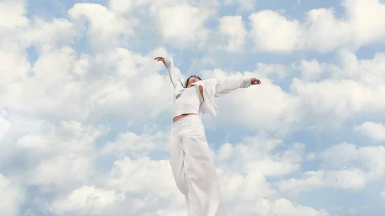
Ohana Magazine – Pantone introduced Cloud Dancer as the Color of the Year 2026 with one goal: to offer peace in a loud and stressful world. The color appears soft and airy, and Pantone believes it can help people slow down and reflect. Many designers welcomed this idea, saying the shade feels clean and soothing. However, not everyone agreed. Some people felt confused by the choice of a white tone during a year filled with tension and uncertainty. For them, Cloud Dancer felt too quiet for the moment. The debate quickly grew, turning a simple design announcement into a bigger conversation about emotion and meaning in color.
Public Reactions Split Within Hours
Within hours of the announcement, online discussions showed clear disagreement. Supporters said Cloud Dancer brings the calm people need. Critics argued the opposite. They felt the color ignored real emotional and political issues happening around the world. Some designers said the shade did not match the mood of 2026. Others believed the color lacked strong character. These reactions pushed the focus beyond design. Suddenly, Cloud Dancer became a symbol of how people interpret color based on their own experiences and fears. The conversation revealed how sensitive and personal color choices have become.
“Read More : Germany’s Approves New Plan to Attract More Military Recruits as Europe Confronts Rising Tensions with Russia“
Creative Voices Question the Lack of Boldness
Many artists and designers voiced frustration about the choice. They argued that white offers little room for exploration and said Pantone failed to show bold creativity this year. Some even noted that white can carry cultural meaning that feels uncomfortable for certain communities. A debate also surfaced over whether white can truly be considered a “color.” Social media filled with comments questioning Pantone’s direction. The tone ranged from light criticism to serious cultural concerns. These reactions showed that people expect Pantone to spark excitement, not confusion. And in 2026, audiences demanded more emotion from a Color of the Year.
Pantone Responds to the Rising Criticism
Pantone quickly addressed the growing backlash. Laurie Pressman explained that the team never considers political or cultural meaning when choosing the annual shade. She said people often attach their own interpretations to the color, even when Pantone never planned it that way. Pressman also reminded the public that similar misunderstandings happened with past colors, such as Peach Fuzz and Mocha Mousse. She insisted that the focus remains on emotional needs, not social messages. Her message aimed to shift the conversation back to Pantone’s intention: offering comfort through color.
“Read More : Tracing the Shifting Story Behind the Trump Administration’s “Double-Tap” Strike“
Why Pantone Believes Cloud Dancer Matters
Leatrice Eiseman added more context. She said the team chose Cloud Dancer because they felt the world needed a “fresh start.” The shade gives room for creativity rather than limiting it. Eiseman explained that white tones can highlight shape, texture, and detail in ways bold colors cannot. She invited designers to explore Cloud Dancer with curiosity and patience. Her explanation suggested that the color is not a final statement but a base for new ideas. With this message, Pantone hoped to calm the criticism and reopen space for creativity.
A Color That Mirrors Today’s Emotions
The debate around Cloud Dancer reveals much about the world in 2026. People want colors that match their emotions and struggles. They look for shades that offer meaning, not just style. Even a quiet color like Cloud Dancer can create strong reactions because people connect it to their own lives. Whether praised or criticized, the color managed to capture attention everywhere. In that sense, Cloud Dancer succeeded. It started a discussion about art, culture, and the emotional power of design. And it showed that color, even a simple shade of white, can carry a story deeper than expected.


